Less is more…that’s how the saying goes. A few weeks ago I wrote about “Think Beyond What You Know”. This is the second chapter to that post and illustrates some of the minimal paintings I have created.
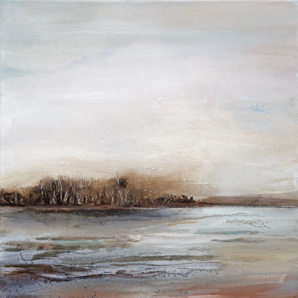
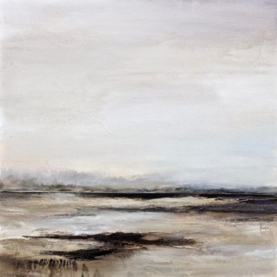
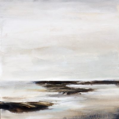
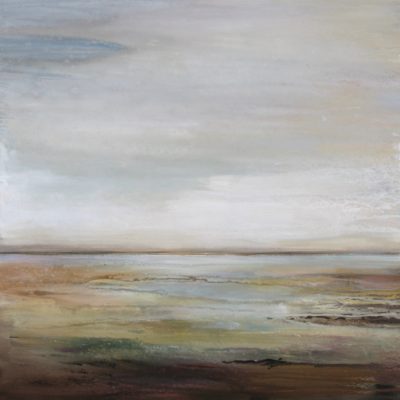
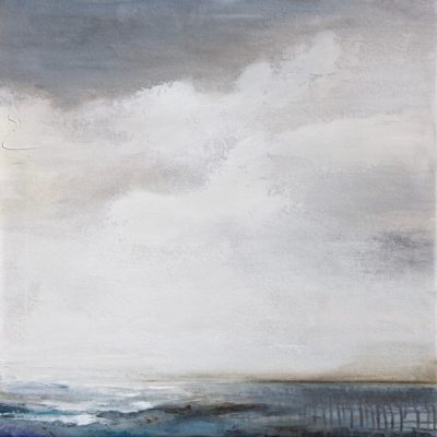
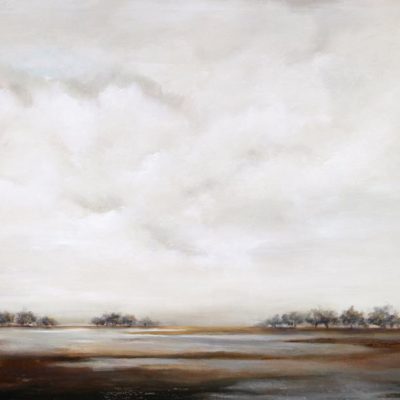
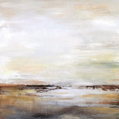
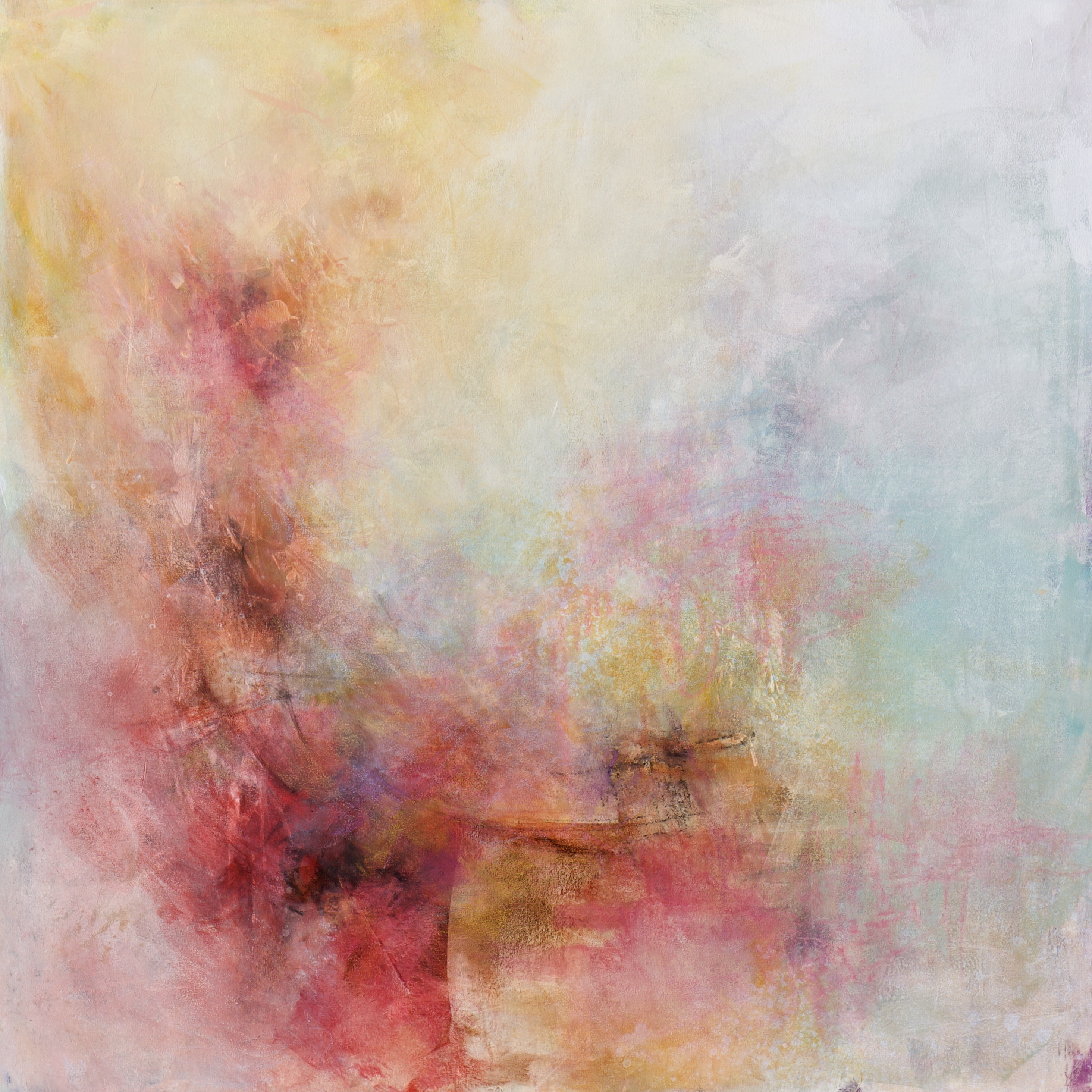
I was challenged a few years ago to do just that in making an abstract landscape. Limited and muted palette and simple form. I must admit it was a little difficult for me at first . Minimalistic painting is not one I had ever chosen to do. I love color and adding lots of layers and textures. I was still able to do some of that mainly minus the color. I use layers of subtle more neutral color and add the texture all the while keeping it more simplistic. I’m happy to report that it worked out just fine. I am pleased with the results and the designer with whom I was working was too.
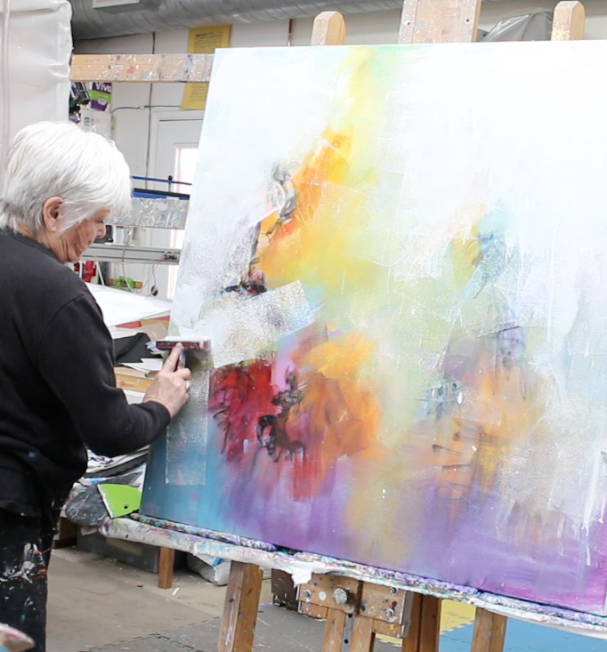
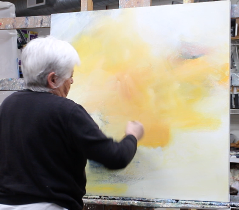
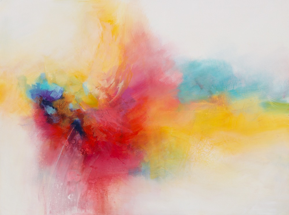
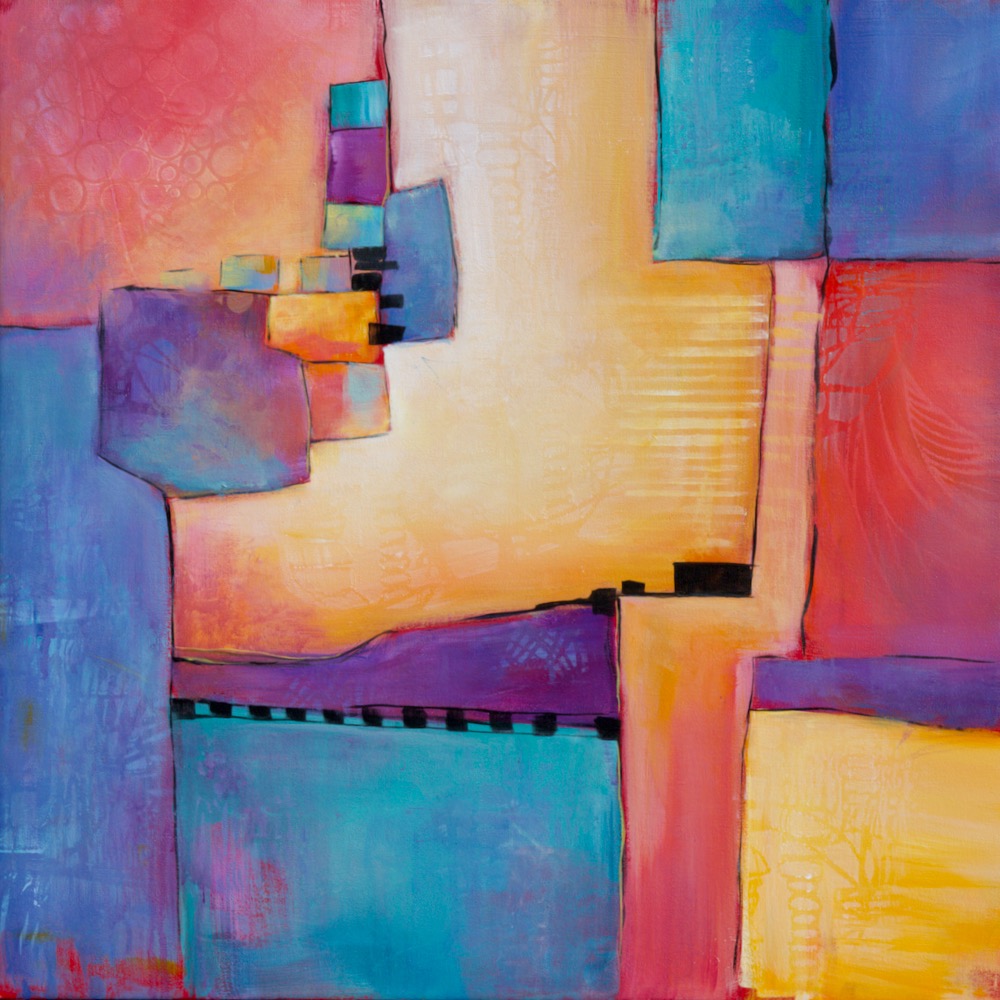
Below are a few samples of where the paintings landed. I’m also including a YouTube video of one of them so you can see the process I used in creating the painting.

I like all of your work Karen but this minimalist style seems to work with your style as well. Thanks for sharing.
Thank you very much, Deb, for visiting and for your comment. I still like working with color but find this very calming.